Back to Work

Karla Learn

What if Financial Literacy Was Actually Fun?
Making Canadian finance less intimidating for newcomers.
Role Lead UX/UI Designer & Front-End Dev
Timeline May – Aug 2025
Tools Figma, SvelteKit
Team 4 Members
Shipped MVP in 3 months
Tested with 5 international students with positive feedback
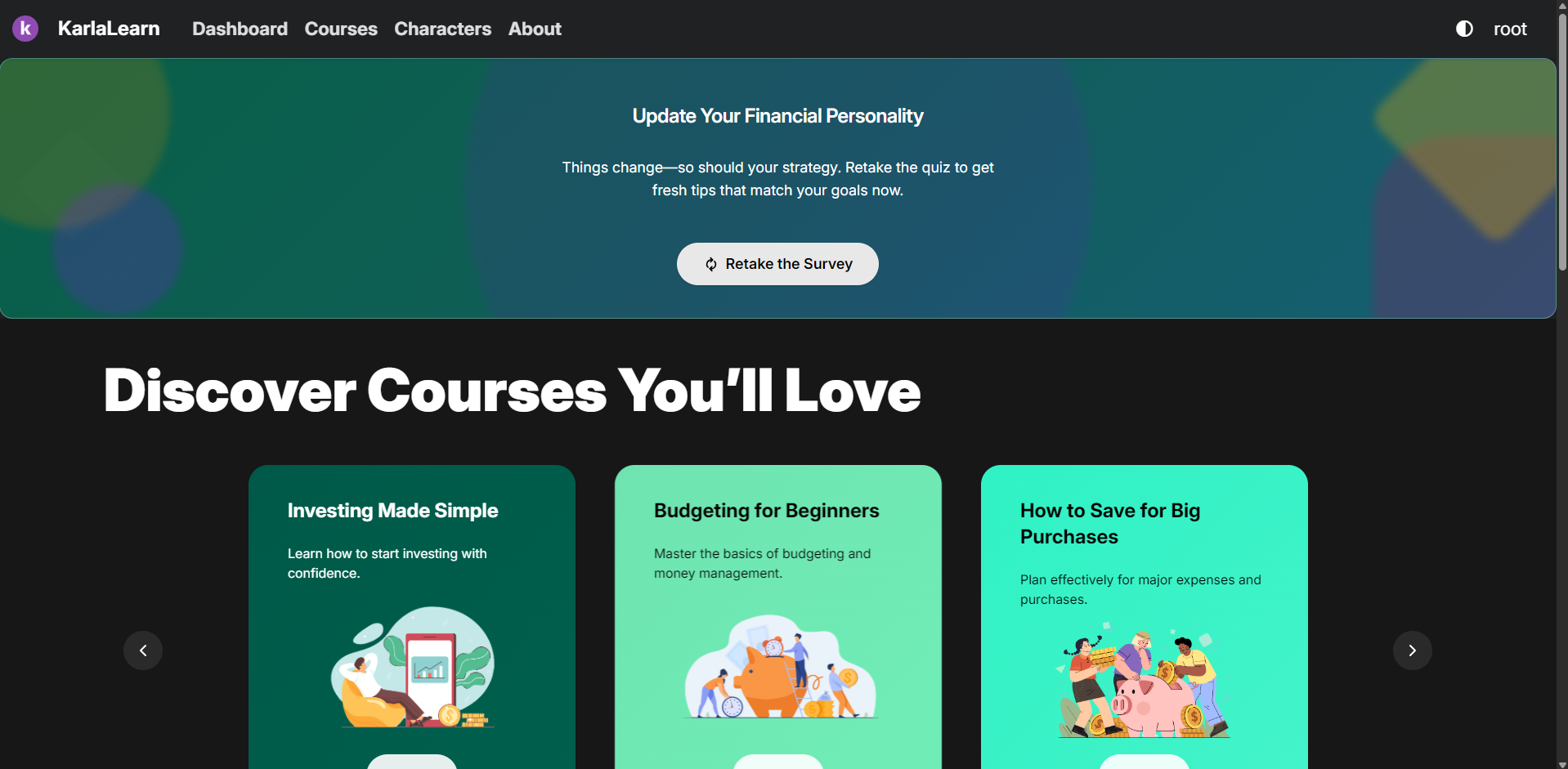
Karla Learn app interface showing the home dashboard

Project Overview

The Challenge

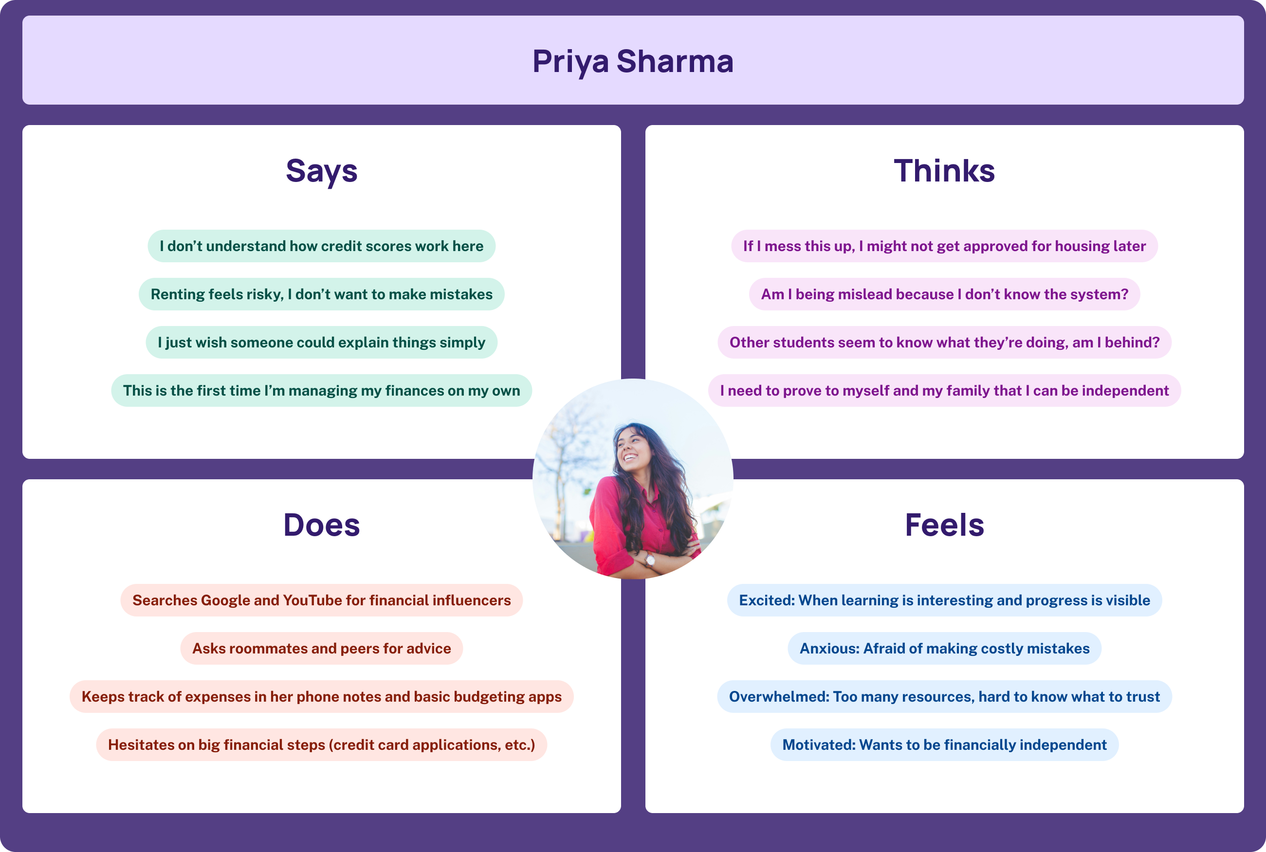
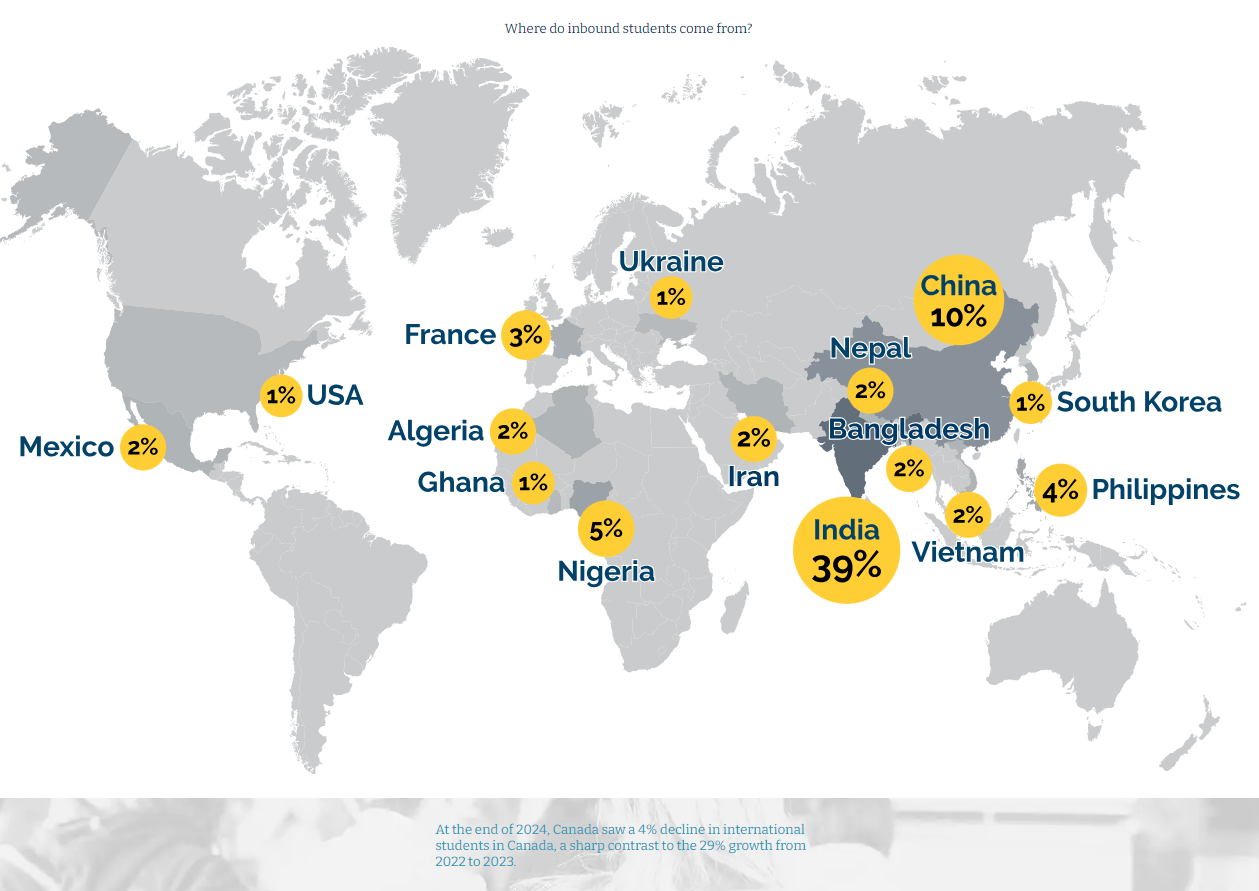
International students and newcomers to Canada often struggle with understanding the Canadian financial system, from credit scores to budgeting to renting. Existing resources are scattered, jargon-heavy, and don't address the unique challenges faced by people new to the country.

The Goal

Create an interactive, engaging tool that makes financial literacy accessible, culturally relevant, and even fun for newcomers navigating money in Canada for the first time.

Scope

Website with interactive modules, quizzes, and personality-based financial learning.

My Role

Lead UX/UI Designer & Front-End Developer. Owned the design process from research through dev handoff.

997K+ International students in Canada (2024)
80% Report concern about paying for their education
3 mo Design & development timeline

The Solution

We created a web application that personalizes the learning experience through playful mascots, gamified progress tracking, and bite-sized modules focused on the most pressing topics for newcomers.

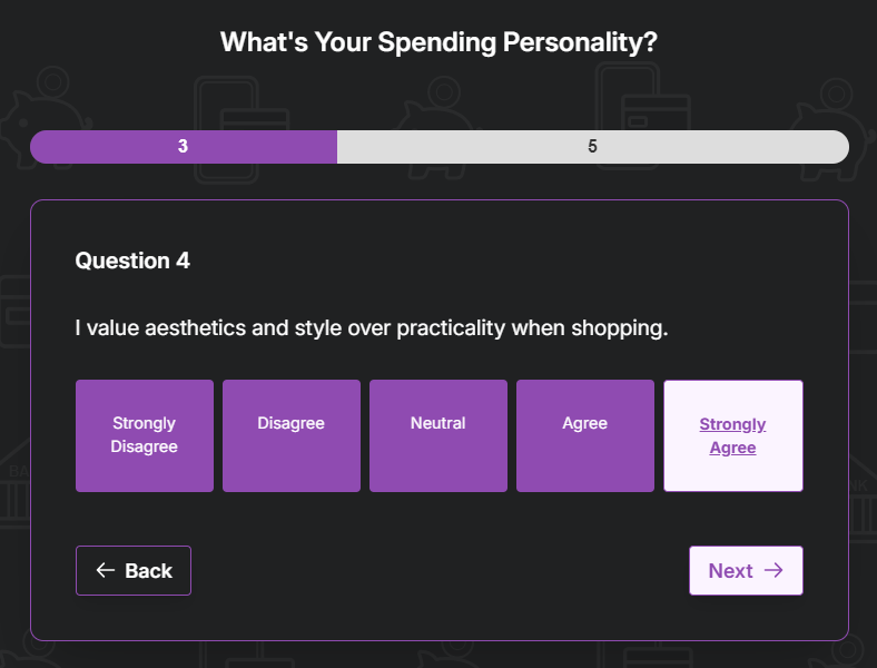
Personality Survey

Four mascots. Four countries. Which one are you?

  • 🐯 Tiger
  • πŸƒ Ox
  • πŸ¦… Eagle
  • πŸ‰ Dragon

Course Modules

Targeted learning paths focused on the most pressing topics.

  • Understanding Credit
  • Learning to Budget

Multi-Browser Support

Accessible and reliable across all modern browsers.

  • Chrome
  • Edge
  • Firefox
  • Brave

Gamified Learning

Motivation built into every step of the journey.
  • Progress bar & quiz feedback
  • Learn Apply Grow
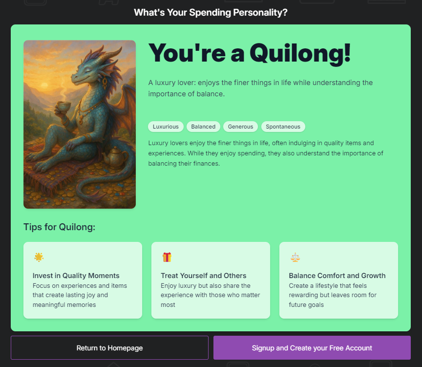
Survey completion screen showing Quilong mascot result

Meet the Mascots

After completing a short personality survey, users discover which financial mascot matches their spending style. Are they a planner or a spender? Or something else entirely?

It's the kind of thing you'd actually send to a friend β€” "wait, which one are you?"

Usability Testing

Testing Approach

Participants: international students

Tasks Performed

  • Completing a personality quiz
  • Checking learning progress
  • Reading module content

Key Findings

  • Progress bar and quiz feedback were highly motivating.
  • Users appreciated plain language + visual icons.
  • Navigation needed simplificationβ€”added breadcrumbs + clearer CTAs.

"I wish I had had a tool like this when I first moved here. Finding out information was difficult and this makes it more fun."

β€” Usability test participant

Design & Development

Built with: SvelteKit + Tailwind CSS

  • Figma
  • SvelteKit
  • Tailwind CSS
  • TypeScript

My Contributions

  • Design system β€” Created component library and style guide in Figma for consistent UI.
  • Front-end development β€” Built interactive pages and components in SvelteKit.
  • Responsive groundwork β€” Began implementing mobile-first approach towards the end of the project timeline.

Lessons Learned

  1. Simplicity Wins

    Users valued clarity and playfulness over feature overload. Serious topics can still be approachable.

  2. Accessibility Matters

    Proper contrast, alt text, and screen-reader labels made the tool more inclusive for everyone.

  3. End-to-End Ownership

    Leading from research β†’ testing β†’ dev handoff built confidence in managing full UX cycles.

Design Brief

Goals

Make financial literacy accessible, engaging, and culturally relevant for newcomers.

Target Audience

International students and first-time Canadian residents navigating a new financial system.
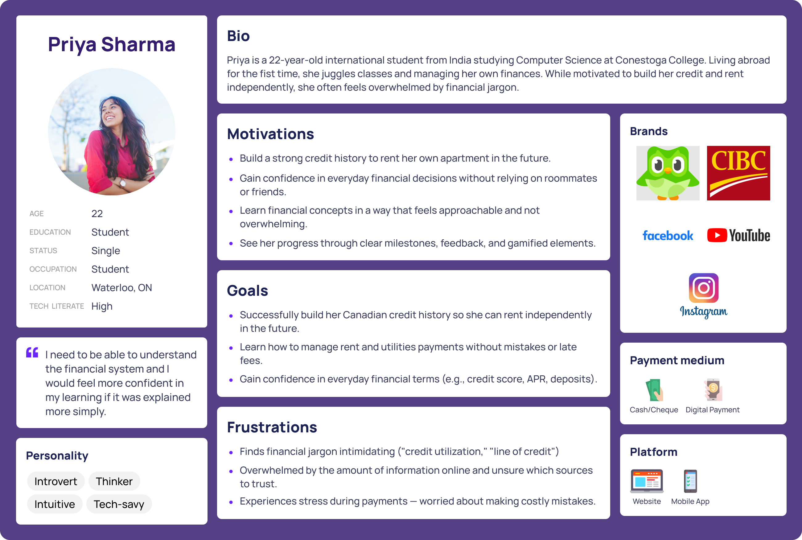
UI Rationale

Layout
Clear card-based modules with breadcrumbs for navigation.
Typography
Large, legible sans-serifβ€”friendly yet professional.
Color
Purple / Green / Teal for trust + playfulness.

Accessibility

  • Alt text & ARIA labels throughout
  • AODA color-contrast compliance
  • Tested across Chrome, Edge, Firefox, Brave

Research & Graphics

User Flow

How users navigate through Karla Learn from first visit to core features.
Entry Point
Screen
Decision
Action
Destination

New User Journey

New User
β†’
Landing Page
β†’
Take Survey?
Yes
Personality Survey
↓
Mascot Reveal
↓
Create Account?
↓
Sign Up
↓
Home (Logged In)
Skip
Browse Courses
↓
Course Page
↓
View Content

Returning User

Returning User
β†’
Login
β†’
Authenticate
β†’
Home (Logged In)

Core Features

πŸ“š

Learning

Browse Courses ↓ Course Page ↓ Complete Lessons ↓ Quiz Results
πŸ‘€

Profile

My Profile ↓ View Mascot ↓ Track Progress ↓ Edit Settings
πŸ‘₯

Social

Friends Page ↓ Friend Profile ↓ View Progress ↓ Add Friends
🐯

Retake Survey

Retake CTA ↓ Survey ↓ New Result ↓ Update Profile

Final Designs

CTA Survey
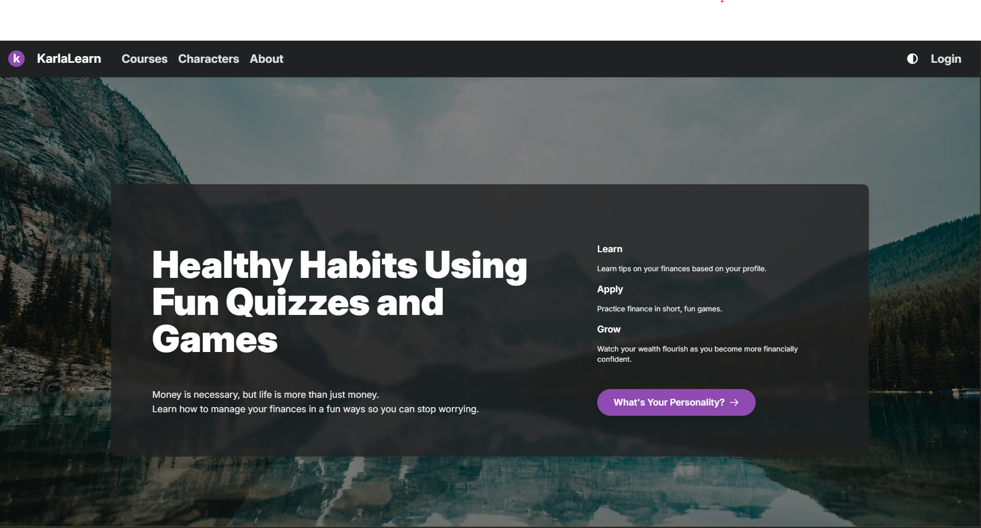
CTA Survey - Logged Out State
Home page of a logged in user
Home Dashboard - Logged In
CTA Survey
Personality Survey - In Progress
CTA Survey Complete
Survey Complete - Mascot Result
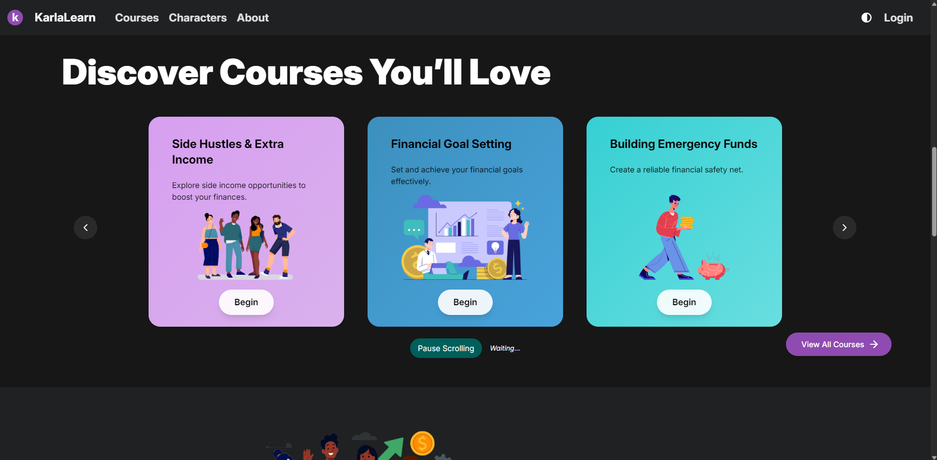
Future Courses
Future Courses Carousel
Join us today
Join Us CTA Section
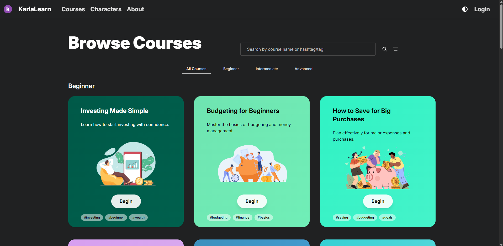
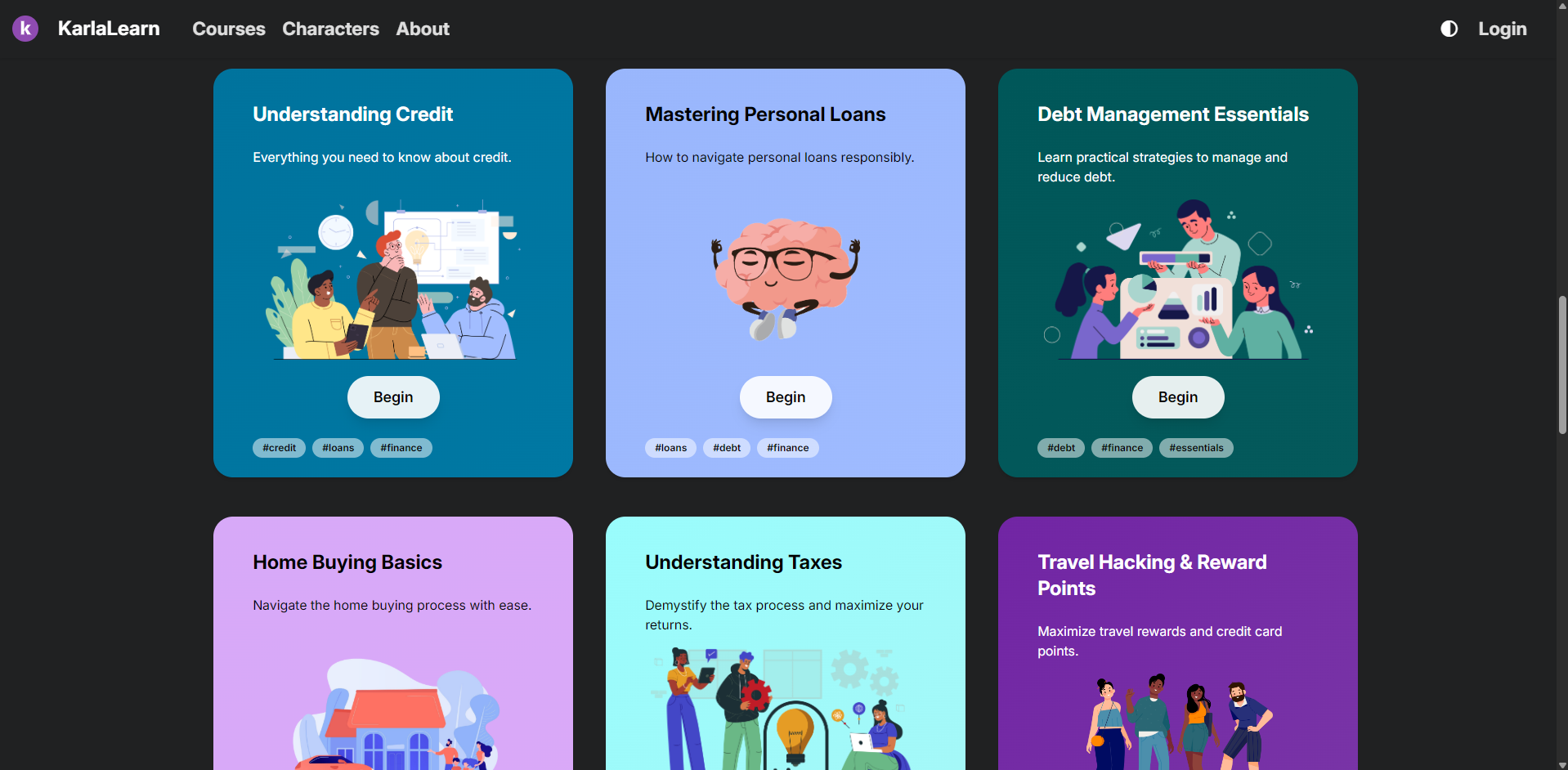
Browse Courses
Browse Courses - Grid View
Browse Courses
Browse Courses - Filtered
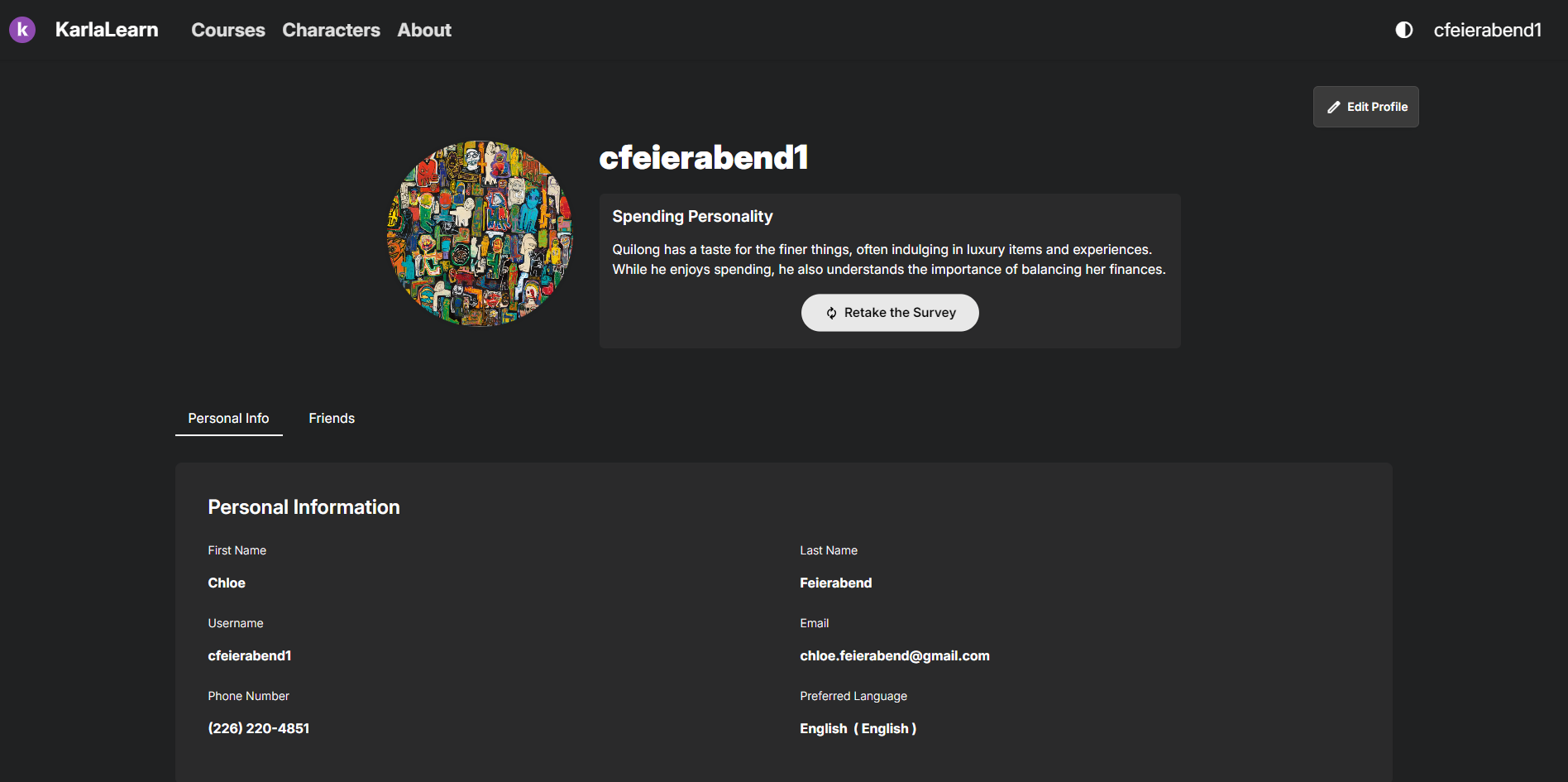
Profile Page
User Profile Page